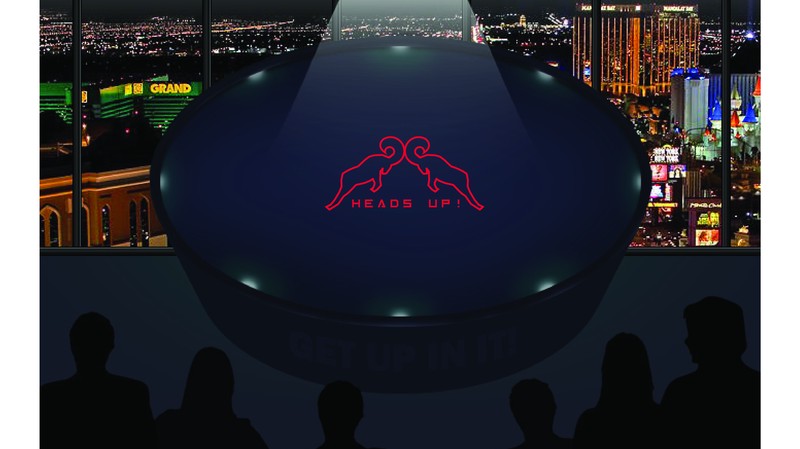
So a few days ago I got another request from my dear husband @tadas :) This time he asked me to create a logo for his own poker series in Scorum Poker League.
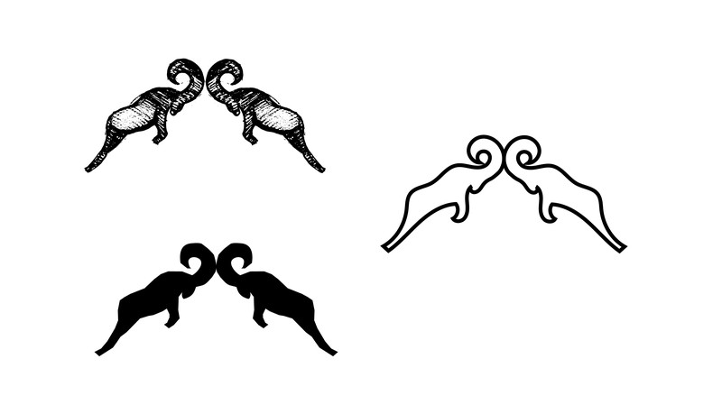
The idea was two head to head rams. And here is the first sketch.
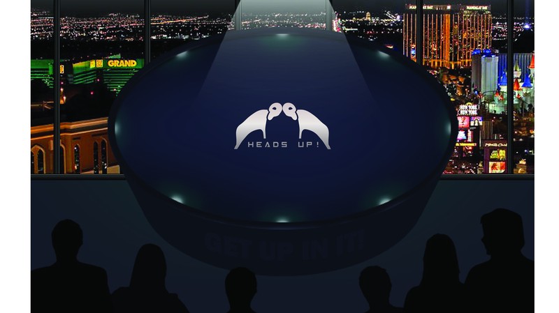
Tried to put it on the table. But they seemed quite weak rams. Tadas did not like it, neither did I. :)
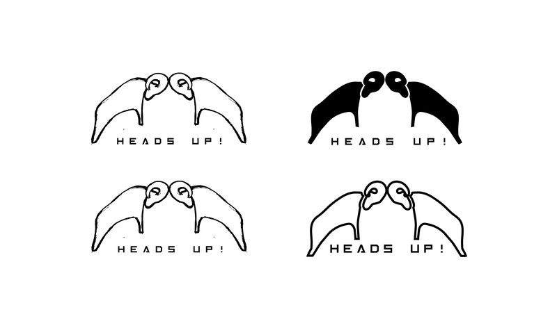
So in the modified version, I drew larger horns and a little bit more visible muscles on the rams. But now they looked like elephants. Do you see them? :)
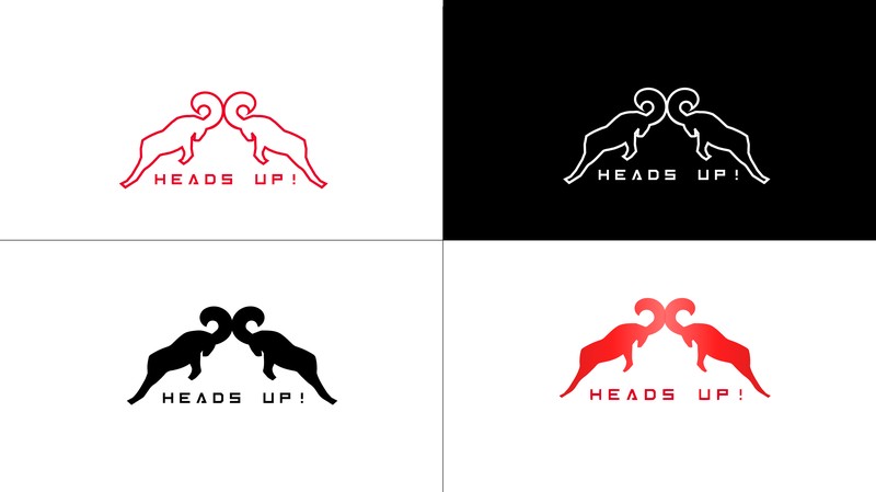
Trying to create a shape, more like a ram, I decided to make the horns smaller and make one small gap where the horns and head meet.
The last changes. I shortened the legs, they looked a bit lean. :) And played with fonts, but the first one was the winner after all. What do you think?
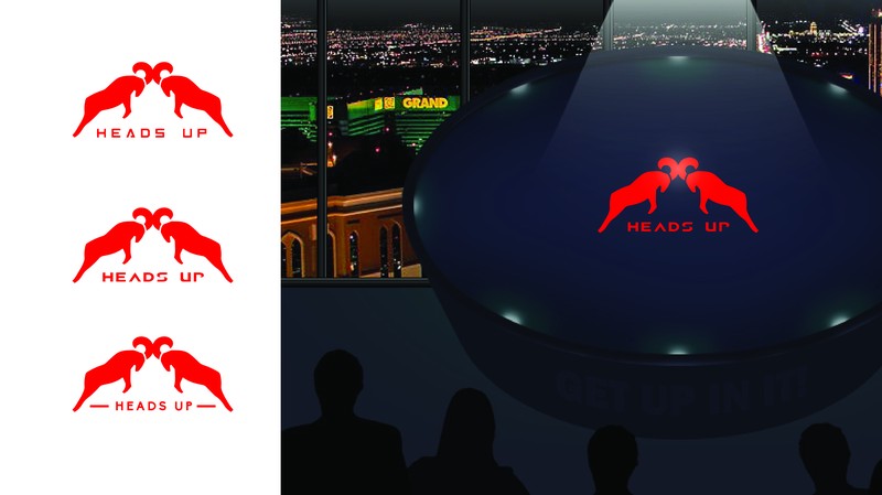
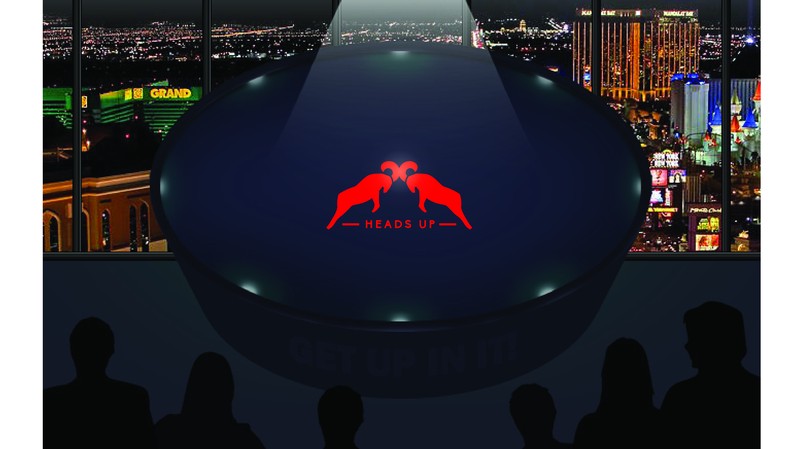
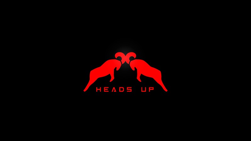
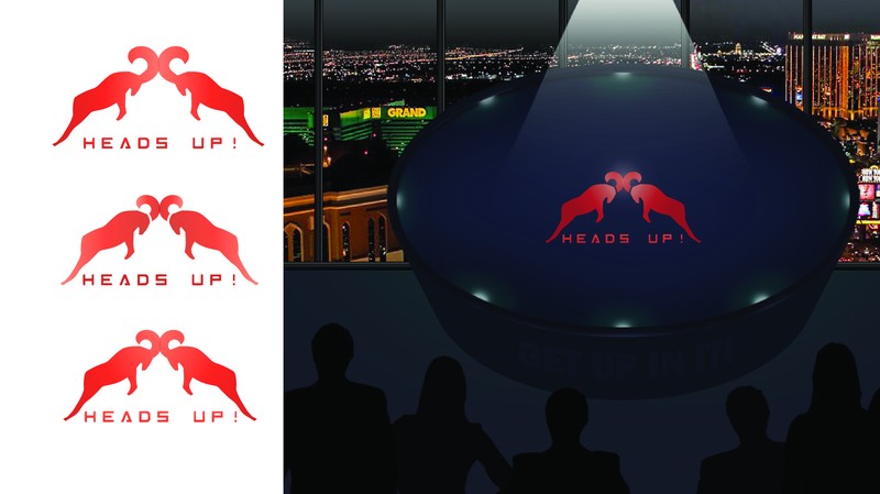
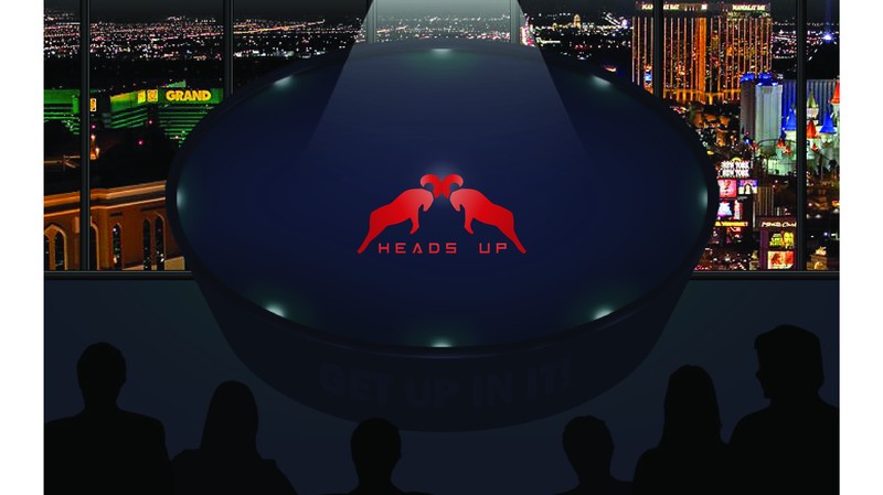
And here it is, the final version of the logo on the table.
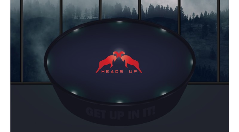
Last, but not least, I changed the background picture of the poker table. What do you think of the logo? Do the rams look strong and angry? :)
Comments