Marketers say that one of the most important marketing tools is a good logo design. It not only provides an easy to recognize identity for your business but also communicates who you are. That’s why every company considering creating or buying a logo design should know the criteria that make for an effective logo.
The first feature of a good and effective logo is that it can immediately “grab” viewer’s attention. Your logo should have an immediate impact and hold the viewer’s attention.
However, if you did manage to catch the viewer’s eye – that doesn’t necessary mean you are doing good. There might always be a hidden penis you cannot see at first sight.
Here’s a list of Top 15 Worst Logo Fails of all time which probably didn’t look so bad at first glance.
Logo of Catholic Church’s Archdiocesan Youth Commission
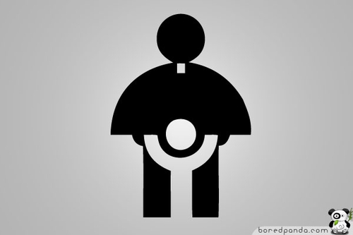
This is an actual logo designed in 1973 for the Catholic Church’s Archdiocesan Youth Commission. It even won an award from the Art Directors Club of Los Angeles
A-Style Logo
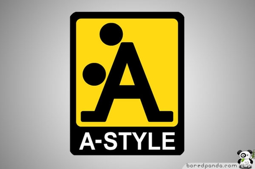
A-Style logo was born well before the line of clothing – designed in 1989 and marketed in Italy since 1999. It was in fact an invention of his creator who began to attack Italian cities with stickers on a yellow background with A-Style logo (an example of guerilla marketing ), followed by other cities including Miami , Moscow and London. The newspapers and television began to be interested in the strange appearances of the logo, and soon the company started marketing their products under the brand A-Style.
Office of Government Commerce
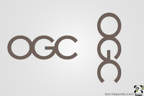
The Office of Government Commerce (OGC) is an independent Office of the Treasury. Sometimes you need to shift your view to realize the error www.ogc.gov.uk
Mont-Sat
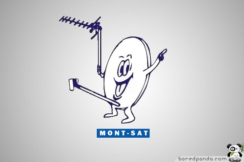
Now you know why Mr. Satellite looks so happy.
Arlington Pediatric Center

just checked their website, and apparently they have changed their logo to something more pleasing. It’s no longer a pedophilic center. Now it has something to do with crabs (look attentively at letter C). FAIL again or is it their marketing strategy?
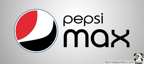
Pepsi
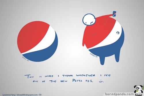
While all this might look like a joke, it gets even funnier when you look at the Pepsi Max logo. It has nearly twice the caffeine of Pepsi’s other cola beverages. We’re not sure what drinking Pepsi Max is supposed to do for you, but based on what it did to this guys tummy here, we’d suggest staying away from it.
You’ll never look at the Pepsi logo the same again.
Clinica Dental

Computer Doctors
Locum
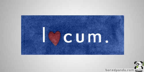
A logo for Locum, a Swedish property management company.
CatWear

Institute Of Oriental Studies
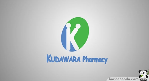
Kudawara Pharmacy
Olympic Logo of London 2012
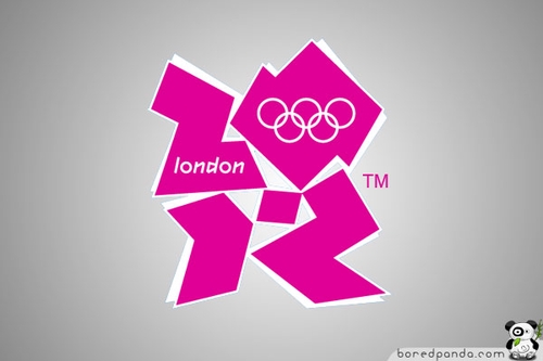
Designed by Wolff Olins at an expenditure of £400,000 (almost $800,000) the logo has been met with expected ambivalence, and, in some unavoidable cases, hatred – actually, so far, in 11,550 cases.
Comments