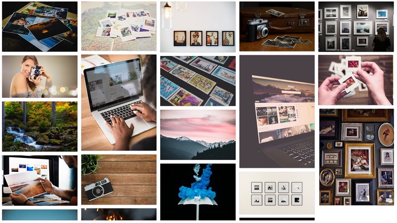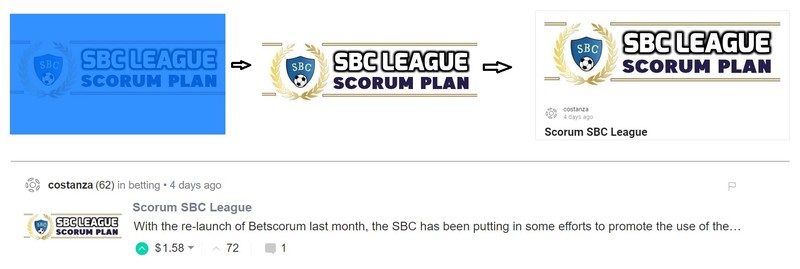
With the SBC League soon to come to Scorum, it's a good time to make a post about the importance of images. The devs delivered a layout that is very appealing visually, but that goes only to the extent where the posts that are made actually have a suiting cover image. Stealing copyrighted images is something that is never really talked about on this platform, yet it is all over the place and we don't really want to support that with the SBC League even though they do make the front page look nice. This post can be seen as a basic guide on how to make posts look decent enough while respecting the copyright law.
The Importance of Front Page Image
Humans are very visual and images are quite important on this platform. It is something that also can be seen with all successful social media content creators. If we want the blogging platform to attract more users and sports bettors that will end up fueling the betting exchange, we can't have the front page full with poor visuals of many tables, screenshots of Betscorum website or bet slips. Having images on your blog that show at least some effort has been put into it helps the platform and will also get you more and bigger upvotes over time.
Finding your own style
I am by no means the expert when it comes down to creating the best images for the front page, but I do what I can and always try to improve learning new things every week. It can take a bit of time to find your own style, but once you do, the entire process of having decent enough images for the front page does not require that much effort.
Scorum and Thumbnail images
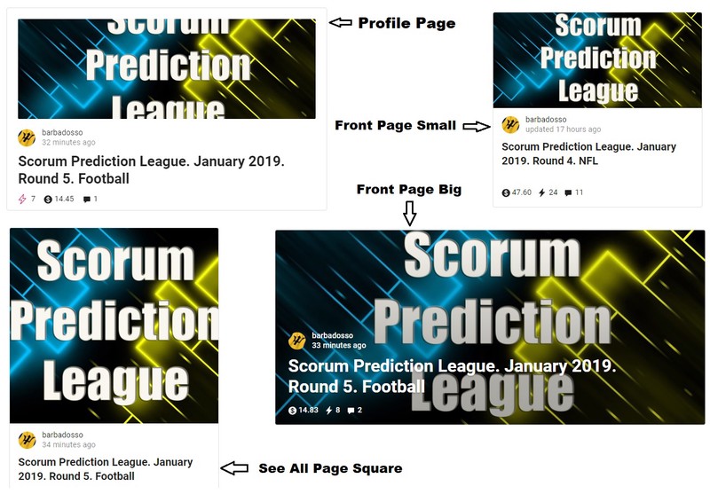
Similar to Steemit, the first picture in your post will act as a thumbnail image for both your personal and the front page. This can be quite confusing because the size of the image will have 5 different variations and making it fit on all of them is quite a challenge.
- Original Picture on a Blog post
- Picture on your profile page
- Small picture on Frontpage
- Big Picture on Frontpage
- Square picture on 'see all' page

Here is a great example I could find from a post from @barbadosso on how one image (resolution 800x408) is cut in different sizes depending on where it is shown. Getting it right on all variations when just using a copyrighted image without any text in it is quite easy, but when you want to create your own it can be a real challenge.
Working Resolution
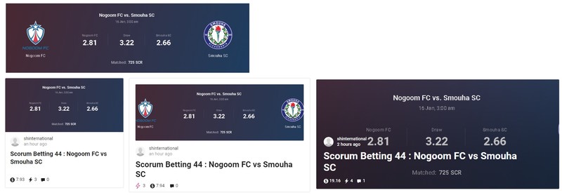
I just came across a post from @shinternational who has a suitable resolution for his Betscorum betting posts. A 800x229 resolution screenshot of the match that is previewed seems to show properly both on the front page and in the profile page

More Solutions
The way I personally try to solve the front page image sizing on betting posts while at the same time making the images also suitable for Steemit (where I cross-post my content) is by using the 800x450 size (or any equivalent) often leaving part of it white and having the text in the mid-upper region. This way it properly shows on both your profile page and the front page in the big and small variation.

Free Image Sources
I'm not the expert, but putting a link to the original professional images that were taken from an outside source (often Google or Sports Journalism websites) still very much violates copyright law. There are many websites and sources available on the internet that provide free to use images that can be used without any issue on blog posts. Some of the sources I use...
- Google Images
There are a ton of free images to be found on Wikipedia. Good pictures of all Stadions can be found there are free to use copyright free. Many of these will also show when doing the google image search. - Wikipedia Commons
There are a ton of free images to be found on Wikipedia. Good pictures of all Stadions can be found there are free to use copyright free. Many of these will also show when doing the google image search. - Free Image Source Websites
There are plenty of websites that offer high quality free to use images. Some of the ones I have been using myself. These kinds of images without any test should all look great on the Scorum main page and it's mostly about taking some time to search for them. Pexels | Pixabay | Unsplash | Maxpixel | Burst | Stocksnap | Negativespace | Freestocks | Pixjumbo | ...
This should be a good start for the ones that want to improve on their blog and the images they use that show on the front page. I will probably make a follow up with a very basic editing and text adding tutorial with some details that might help the ones that want to create their own style.
Please share your own sources, tips and ideas when it comes down to where you get your images from and how you get it right especially when it comes down to betting tips posts in the comments below. I will make sure they will end up on top for future reader reference.
Comments