I would just like to start by saying great work Scorum on the launch of ScorumBet! The design is very contemporary, clean and minimal for maximum efficiency. For myself everything in running smooth, great load time, scores updates etc.
I have a lot of experience in web design, pre and post studies to become a graphic designer from university. I enjoy and understand all forms of design and I must say Scorum is on the right path! There are a few fixes that I noticed in my quick first impressions.
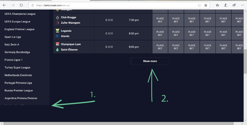
Number 1.
So you can from above (number 1) this doesn't work. the menu ends suddenly and although works properly with scrolling the sudden sharp ending and cutting off typography doesn't work. It's common knowledge if your going to do anything look to the best in field and learn from what they are doing (even if your doing something new).
Betfair uses similar approach
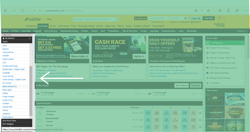
The only difference being betfair's is static, meaning if you scroll down the centre odds, they move but the side menu and top navigation menu do not.
All the iconic betting sites have a direct menu till it's end on that left side. This meaning it has no cut off point unless the options end of the bottom of the webpage. Number 1 and 2 pointers I showed in the first image of Scorumbet have a huge grey area below them that scrolls even further before reaching the footer of the webpage.
Number 2.
"Show more" trivial in it's definitive purpose. People don't really want to click "show more" which odds are they are going to have to do because right now the page only shows 10 matches. If you clicking "show more" then your searching for a match..... but right now all the leagues are on the side menu...? So the show more option has no value in it's purpose other than to shrink the front page, which in part makes sense but at 10 matches only directing at 1 sport (at the moment) leaves it trivial.
Menu alignment off?
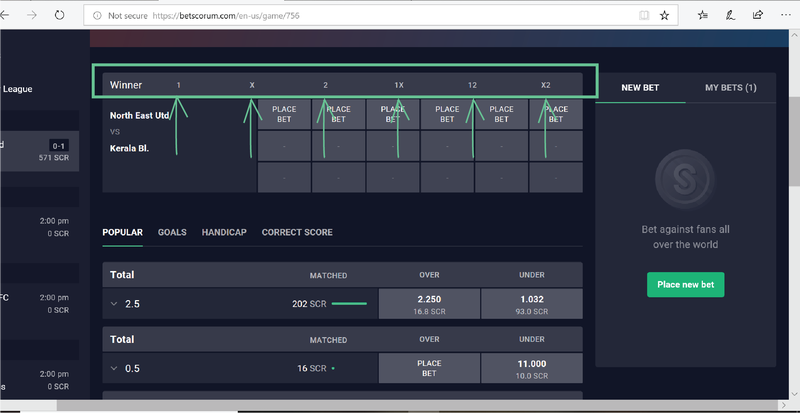
This is a strange one because I thought initially it could be my browser so I tried Edge, Chrome and Firefox and all did this above. Also I usaually like text bigger so I set zoom in/out different but that wasn't the issue. You'll notice the numbers are way out of place and should align to each box saying "place bet". This problem appears only on the match page where there are more bet options.
League/Location of a game
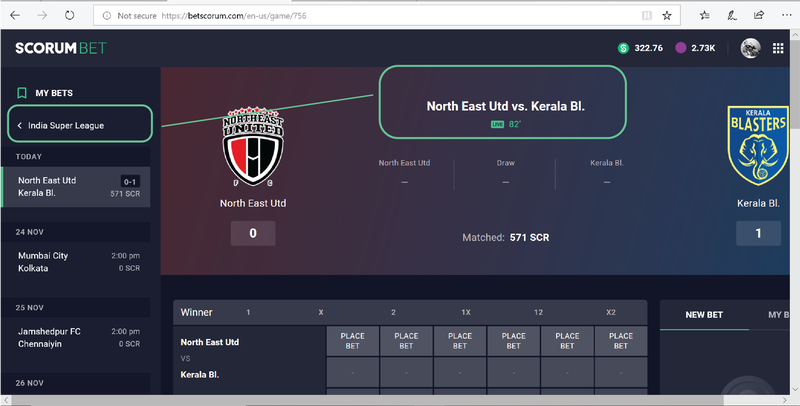
This last one is not a big deal however it took me 3/4 attempt's to find the league/country this game was in. I'm not certain but sure the option on the left wasn't there for a while today... if it was the fact I missed it maybe says something. People read left to right, websites do that too but only on the centre page of purpose. The navigation on a left menu is subconsciously dismissed, when you think, quickly "I'm on the football match page, I see the teams playing" where would you guess the league would be? Generally I find going to the top left is always a sense of going backwards online and personally I would've guessed/expected it to be smaller typography, just above or below the teams in the centre.
That last one is really nit picking the brain and navigation but believe it or not the biggest companies in the world pay good money for detail and efficiency.
Update on this showing the league -
I noticed later that if your browser is set to zoom +100 in setting for whatever reason, like me I struggle to read some text then on betscorum you wont see the league on "upcoming games" on the front/main page. If you zoom out a little to the conventional setting size @83% it shows you the league. So this last point above is almost void, if you cant see the league on the list of upcoming games go to your browser setting in the top right.
Thankyou again ScorumBet! I love the look and feel of the website and everything your doing in-between as a company. Keep up the great work. :)
Comments